Most trackers ask you to file a form. This one asks for a number and a category, and it is already the shape of the thing you were going to do anyway.
Type 10 and you get 10, not 0.10. The “.” key is there when you want cents. Tap any digit to fix it in place.
The ones you actually use rise to the front, ranked by last month's habits and frozen for the month so nothing shifts under your thumb.
No sign-up screen, no onboarding carousel, no password. You open the app and it works.
Four screens. That is the entire app.
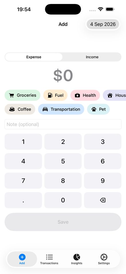
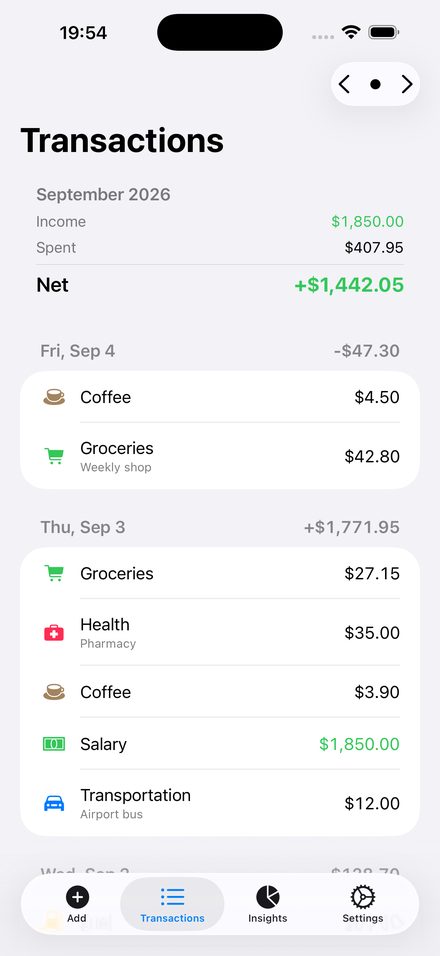
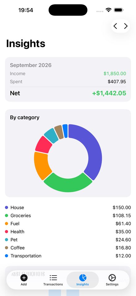
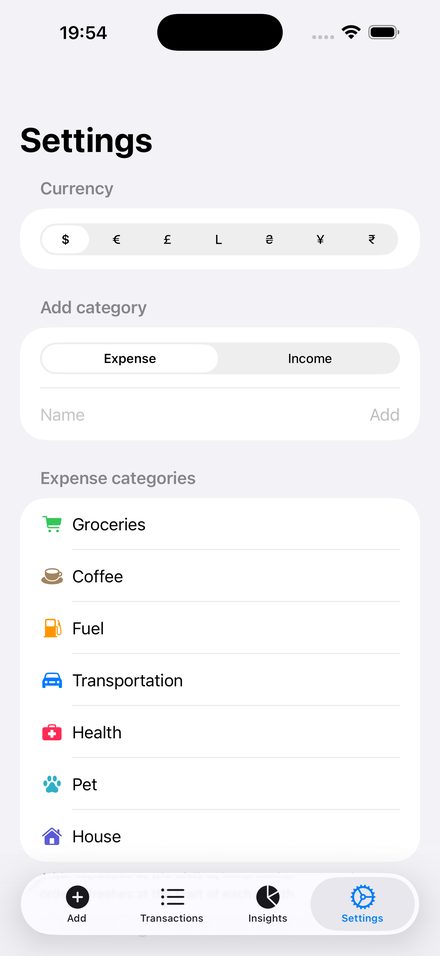
Everything you log lives in a database on your iPhone. There is no server, no login and no sync — so nobody, the developer included, can see what you spend.
That is a real trade-off and worth saying plainly: because there is no cloud copy, deleting the app deletes your entries. Settings → Export CSV gets your data out whenever you want it, in a format any spreadsheet reads.
Sundry is free and carries one small banner at the bottom of Insights and one at the bottom of Transactions — after the content, never on top of it.
There is no banner on the entry screen, nothing between your transactions, and no full-screen ads. Not now and not later. That restraint is the reason this app exists.
In the EEA, the UK and Switzerland you are asked before any personalised ad is shown, and you can change that choice at any time from Settings → Privacy options.
iOS asks you once whether ads may use tracking, and either answer is fine — your expenses are never part of it, and they never leave your phone.
Not just spending. The monthly total is a signed net, so a month that went red looks red.
Where this month went, by category, and a six-month trend beside it.
Any colour, any icon, your own categories, and your currency symbol.
English · Română · Русский · Français · Italiano · Deutsch